

Welcome back to the Greatest Graphic Designer Cycle 1, Last time we had 9 people duke it out in a challenging task that boosted their creativity. They had to take a creation from any collection of Yves Saint Laurent, and remake it to their owns liking. We introduced to you the 3 judges judges! Today we introduce a guest judge, Carmen Bynes!

As of right now, Carmen is one of Stardoll's hottest socialites, and graphic designers. so you might want her on your side this task, or her scores could possibly send you home! Here comments are in RED
Now, We will get on to the judging, the scores, and the elimination. Unfortunately, Brandy, and Julia had to drop out. We now welcome Dani to the cycle!
THE JUDGING
The first designer up is
GABRIELLE

Roxanne: Wow, this is the first task and you are impressing beyond level! The graphic itself is made pretty well! I love how you went with a very elegant look, and the zebra hat was a perfect edition! The only thing I don't like about this certain image is the hair, it looks very stringy. The fur could be a little more clean, because right now it looks like very thick dog hair or something. Other than that the clothes and the legs are just perfect! I give you a 8.4.
Carmen: I love how you didn't go with the runway background! It stands out and like this and it's perfect. I love the outfit you've picked and I love what you did there! Top part of the graphic is perfect - fur risk you handled well, amazing top and the bow shading, gloves, hat... But something's bothering me around that hair, it needs a bit of practice and more work over there. The skirt could've been better. I don't like how it's shade is different than the top one and shading there totally needs some more work. Right knee - more work and less shadows. 9.0
Bianca: I like the hat but I think your hair technique needs serious work.
I really admire your technique on the top, it's really good, and clean.
The fur however is not sitting well with me, it doesn't look properly done, the
edges look too sharp and I think they should have blended nicely. The gloves are perfection. The skirt and shoes look rushed, I think you should have taken your
time to perfect them. 6.0
ARGANA

Roxanne: Wow, the first thought that came to me when seeing this. I love it. The model choice is very smart. Tania has a face that is striking, and the coat is just that! Excellent choice! I really love the coat, the shading and highlighting is done very well. Unfortunately you didn't really exceed in neatness. A lot of the shading in the graphic itself seems very sharp. But even so, it still looks really good. A problem I am having is whether or not the shoes match with each other, It almost looks as if one has a different print than the other. Overall, a very good start to the cycle! I give you an 8.8.
Carmen: I love this! The leather coat caught my attention as soon as I've seen the graphic. I love everything about it! The color is so eye catching and when you notice the work and quality on the leather it's really worth it! Makeup is suiting perfectly, model choice is amazing, hairstyle - everything! Shading on the top of the right leg is bothering me honestly, but that's just a tiny little bit in this wonderful piece! So far the best! 9.8.
Bianca: I am totally loving this. The technique on that leather jacket is so good, the color makes it really stand out. The legs look constructed properly but the shading on the right looks a little out of place. Tania looks perfect in this. 8.0
SKOURI

Roxanne: Well, I really like this! Although I am confused, because I don't think you made it your own? It still looks like the original piece. The dress parts, and the breast area look almost as it is filtered! I do not know for sure though. The breasts, to me are a no no, I am not a fan of that style, but I must judge you on the task itself, So, overall its okay. The fur is superb, the face is good, but looks uneven for some reason. The hair, is to die for. Overall, I like it but I don't think you followed the task all the way. I give you a 6.4. I do not think Carmen gave a fair score, there is still some graphic work in it.
Carmen: I am so happy to see the nipples, to see the freedom of woman! Love the picture. Love the outfit. But the graphic - no. It's totally obvious that the picture is simply covered by filters and some poor shading work to hide it. This is not graphic work. This is not worth the title of this competition. This is a disaster. You should be ashamed for applying such a hideous cheat - people spend hours on graphics! 1.0
Bianca: Nipples! nice. I'm going to be very honest, this looks filtered to the max. It looks more like a painting than a graphic. From the neck to the fur looks really weird and filtered, the bottom half looks like a regular picture. The skin on your left hand looks great though. 2.5
KIRSTEN

Roxanne: So this is by far my favorite entry as it is the first to not use a runway. Instead you took an ad campaign. You definitely are not the strongest designer here in terms of hair, but what you lack in hair, you make up for with the rest. The model is a great choice. You have such a clean and neat fluidity when is comes with shading and highlighting, the lines are perfect! I really am impressed with this! I really am. This feels very vintage, and I'm a fan of vintage. It is the colors. Overall I love it! The only thing you need to work on as of now is the hair. I give you a 9.4.
Carmen: Wow! I love this one. Totally the best thing I've seen in this task. First of all, choosing this pose is amazing and I totally adore it! Shading everywhere is amazing, flats and the dress everything is looking so good! And that hair is like a cherry on the top of a cupcake! My favorite, 10.0
Bianca: Fantastic! The dress looks good, the skin shading is on point but the left hand looks too straight. Too straight in the sense that I don't think we hold our waist like that so the wrist should have been bent a little to show a sign of 'reality'. Your hair technique is so good but it needs a little work. Those flats are perfection. 8.5
DANI

Roxanne: I really like this. It is super simple, like you could wear that down the street, and you would have all eye's on you. I wish you hadn't used your own medoll, and showcased someone else, but oh well. I love the shading on everything by the way. It is a really strong graphic. Very well made. Unfortunately it isn't as fun as everyone else's so it lacks in spunk. Overall, not a lot to fix, I just wish there was some sort of background. Overall, its one of the better ones skill wise, but overall the most boring. I give you an 8.5. Ok, so It has been confirmed that none of these items in this shot, is YSL. The whole task was to use YSL, and you didn't use any of it. So I must drop your score. You now have a 6.5. Next time please follow the task.
Carmen: Okay, so the task is failed. No Saint Laurent here. No Yves, no Hedi. Nothing. I see nothing, and that ruins your whole work. Graphic itself looks well made with some of the small mistakes on some places but it looks nice. It would look nice if anything there was actually from Saint Laurent - you know, Jenner was wearing it too. 2.0
Bianca: Last I checked, the task specifically told you to wear YSL not Nelly. Don't fret. Your work is good, it's just not on theme. The hair looks good. The skin between the top and jeans looks really rough and plain. 3.5
MEALANIE

Roxanne: So, overall, I feel you had the best remix of the clothes, but I feel it isn't the best graphically. A lot of pointy and rough edges and shading. Your highlighting is on point, especially in the hair. So on to the hair, it pains me to say this but it is really bad, well the shape of it, but like I said the highlighting is really good. I do like bag a lot. It is really well drawn. Overall, the best remix, but you need to work on the shading a bit more, and work on neatness. I think you should study shading on real pictures, and notice how it isn't sharp, its vary organic, like circular and fluid. I give you a 6.7.
Carmen: This is a hot mess. A total hot mess. Graphic looks completely messy and bad, rushed. Your shadow game is so harsh and uncomfortable, edges aren't straight... Outfit choice is decent but you could've gone with something so much better. Some classic vintage Saint Laurent or Hedi's latest couture comeback would have been better on so many ways. Except the graphic ways. I really hope to see you improve and succeed as a graphic designer until the end of this competition but this is totally not something worth ''The Greatest Graphic Designer'' title. 1.7
Bianca: Yikes! This is a mess and I mean this in the nicest way possible. I'm guessing you did the graphics for screamers. The dress looks rough and rushed, the bottom half looks really bad, the red on the bottom of the trousers looks like you used paint. You should have taken your time to graphic this properly. 1.5
BETH

Roxanne: So, I really love this task! I love the quality of it, and I love the way you shaded and highlighted the dress Maria is wearing. I love how you made it an ad, and not a runaway like 95% of everyone here. So EXTRA for the originality! The only thing I really don't like here is the model choice. Maria, as much as I love her and her face, just doesn't go with the outfit, in my eyes. Isabella's outfit is PERFECT. But her head seems off, and the hair seems almost as if it might be falling off! I love how you added YSL onto here! PERFECT. I give you a 9.4
Carmen: I like that! I love how it's not runway pose or something like that. I love the pieces you've chosen and I totally love the quality of this work. Anyway, Isabella's head is totally off for me. It's almost supernatural, neck is missing and it looks super weird. While practicing during this competition, I believe you'll start making more details around hair but this is amazing and you've done a great first impression! Great job! 9.0
Bianca: My favorite of the week. I love the quality of your work, I love the fact that you used not one but two models. You've really improved in your hair technique and I admire that. The only thing I can pick on is the fact Isabella is neck-less. Amazing work for your first task. You are definitely the one to watch. 9.5
Now for the CHALLENGE.
You were to create a DIY outfit, or dress out of anything other than clothes. Who ever did it will get an extra score boost of 1-5 points. The Challenge winner will get a score boost of 1-10 points. ONLY if we had more than 2 entries. This Task we had entries.
SKOURI

So this is really good! I love the detail, I love the whole outfit, and the dress shape. Unfortunately, you were supposed to make a DIY dress out of anything but clothes on stardoll itself. So I will give you a 3, since it looks so good!
So, that concludes the judging. We will now move on to the RESULTS.
THE RESULTS
We started this cycle off with 9 contestants. Brandy Julia and Nora, had to drop out due to personal reasons. No hate to them, I wish them luck in the future. 7 of you amazing and talented contestants handed in some of the most amazing graphics I have seen, and some didn't impress so much. Who gets best photo this week? Who will fall behind?
Best Photo is...
There was actually a tie between Kirsten and Beth with a total score of... 27.9!
Only one gets to win, and it is up to the feedback... Best Photo goes to!
Kirsten - 27.9
2. Beth - 27.9
3. Argana - 26.6
4. Gabrielle - 23.4
5. Skouri - 12.9
Bottom 2
Dani, and Mealanie
Dani, You were the wildcard in this cycle, so for you to be in the bottom 2 in very scary. It isn't because your graphic was week, if it had been a task to create an outfit it would have been taken better by the judges, but the reason you are here is because you failed to follow the task correctly. The task asked you to take any YSL or Saint Laurent piece, and make it your own. Your graphic didn't feature a single item from any of the choices.
Mealanie, I think you know why you are here, as you read from the judging, this was not the best graphic. It was very weak next to the other entries. I on the other hand liked the design of the clothes, while the other 2 judges weren't convinced. That is why you had such low scores.
Who stays in this competition? Will it be the designer you doesn't follow the rules, or the designer who couldn't convince?
Both of you stay, 3 people were disqualified. You two were given another chance, don't end up here next task.
TASK 2
Now that we got that ugly situation out of our hands, lets take a look at what you 7 will be doing this time!
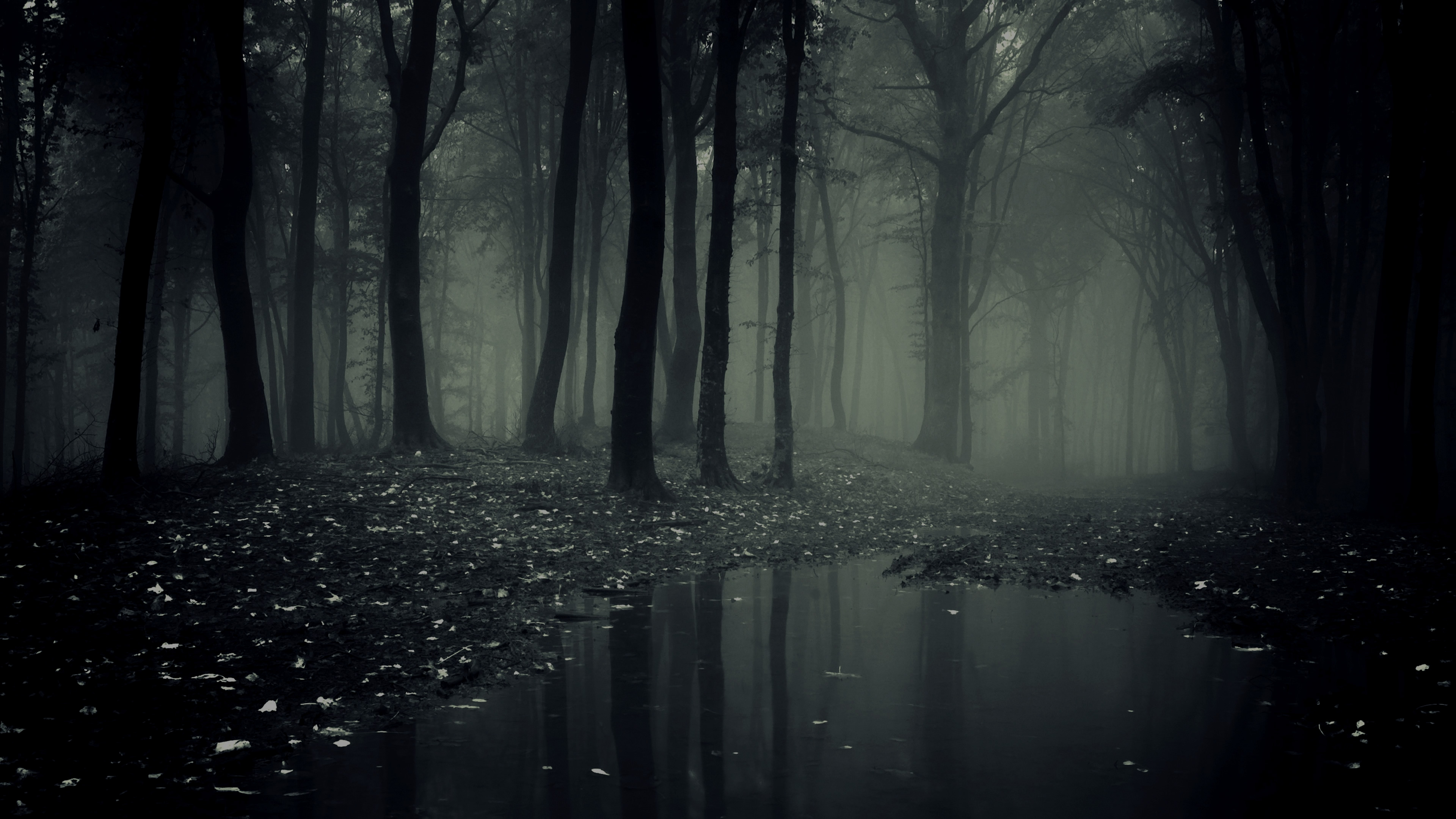
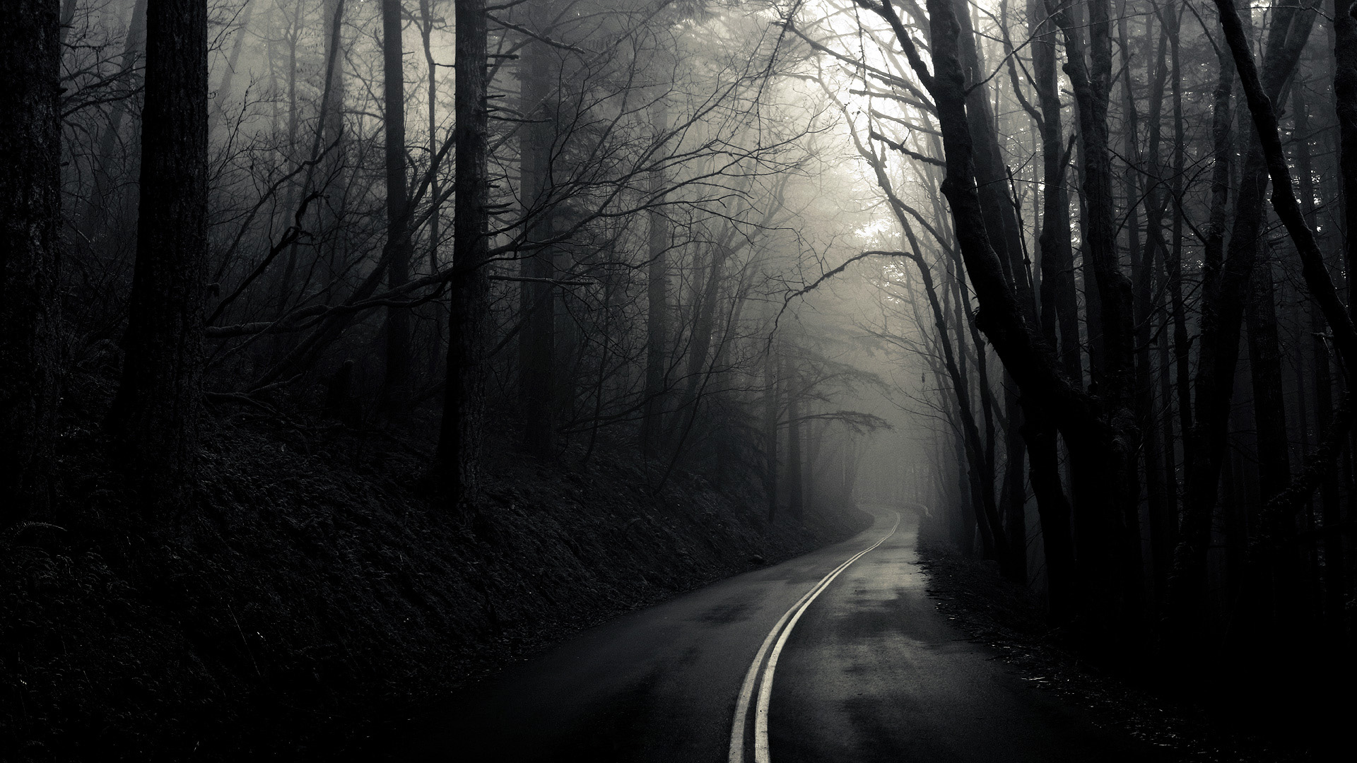
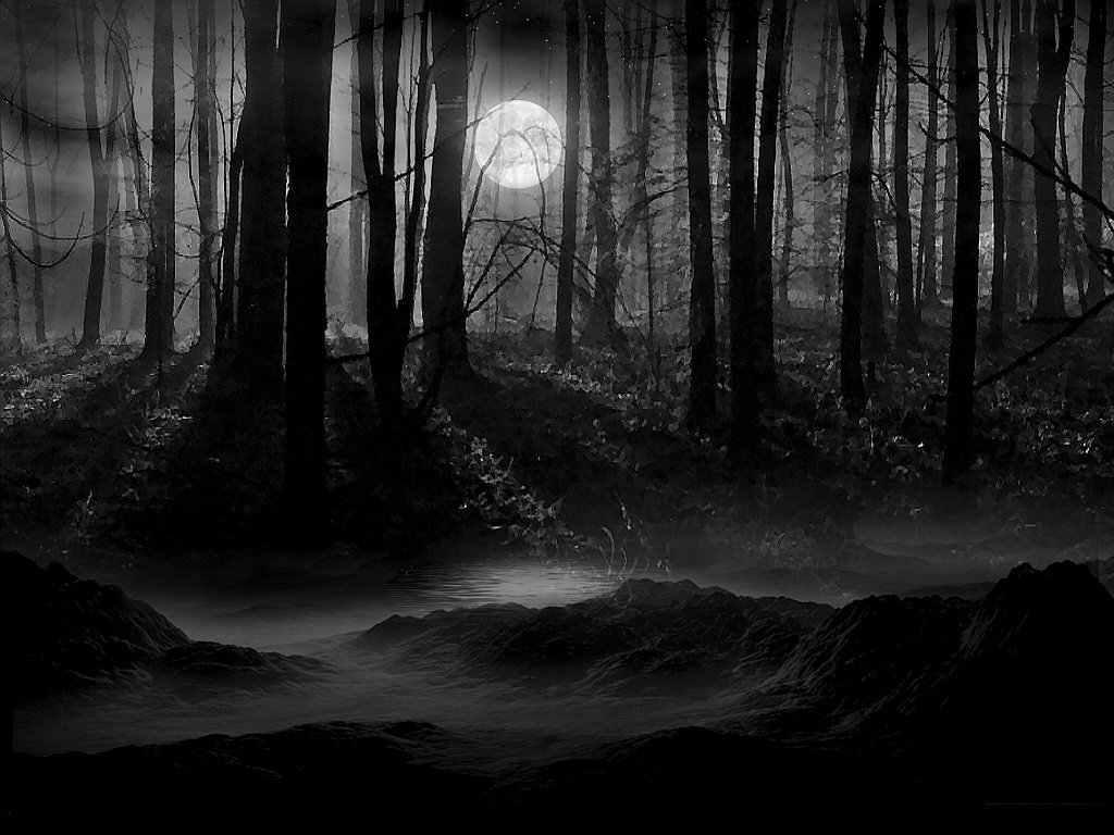
A Creepy Forrest
This time around you 7 must go into the Dark Forrest were you will be creating a very eerie and dark graphic. They must be wearing black leather, and feathers, keep in mind I want dark colors. Don't be afraid to go ALL OUT. I want to see emo/goth/cult/crosses/ etc. I want it to be very dark and eerie. I will also be giving an assigned theme. there are three themes randomly drawn for you! Cross Roads Demon, cult, and The Evil Queen. DO NOT USE YOUR OWN MEDOLLS.
Kirsten: You got Cross Roads demon theme. Find a creepy road in the middle of a Dark Forrest, find some vampy looking model, make it look freaky!
Beth: You got Cult theme. Find some crazy model, find a creepy ritual in the Dark Forrest! Scare me!
Argana: You got The Evil Queen. An elegant beauty should go nice with some darkness.
Skouri: You got The Evil Queen. An elegant beauty should go nice with some darkness.
Gabrielle: You got Cross Roads demon theme. Find a creepy road in the middle of a
Dark Forrest, find some vampy looking model, make it look freaky!
Mealanie: You got Cult theme. Find some crazy model, find a creepy ritual in the Dark Forrest! Scare me!
Dani: You got
Cross Roads demon theme. Find a creepy road in the middle of a Dark
Forrest, find some vampy looking model, make it look freaky!
STUCK? Here are some inspirations!
So, I hope you have an idea of what to do! If you have any questions contact me from Facebook, you are all my friends on there, or VIA dollmail MissFoxyRoxy913.
The Challenge: Take the same model, and same background and make a jewelry ad campaign with your OWN custom jewelry.
Task 2 is due: Wednesday August 26, 2015
Good Luck
XoXo Roxy