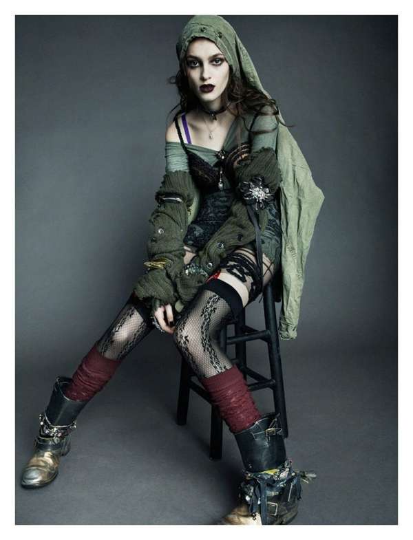
Okay! Let's get on with the judging!
The Judging
Kirsten: Lil_rocker_grl (cycle 12)
Roxanne: This is by far one of your best entries! I shared with you that my sister was so happy to see her as the model! she really looked forward to it. And I feel its amazing when people feel things when they look at a graphic! Your shading is near perfect, especially the neck,stomach,and hands.. i am beyond thrilled! Like i have said before, there is something that kind of bugs me about your hair technique! Literally, that's the only thing i don't like about the picture, but even then its amazing! My absolute favorite thing of this is the bikini, oh my goodness do I live for it! The shading on the cloth is just so real, and the jewels are fantastic! Overall I am really impressed!
Bianca: Your skin shading is on point as usual. The bikini top is so lovely. The
necklace looks amazingly drawn. The bikini bottom needs work at the side. The hair is really off, it's easy to tell that you're not so good at drawing it.
Skouri: Kadet12 (cycle 17)
Roxanne: I really think you did a good job! The suit is really well drawn! I really dislike the way the face is set! You always blow me away with your skin though, and your hair! I feel in the matter of a couple months you went from ok designer, to an amazing graphic designer in this competition only. your other work amazes me! Good job! There really isn't anything else to say!
Bianca: The hair on this work is beautifully done. I really like your technique when it comes
to shading clothes. However, the skin on the right hand is badly done. The cleavage area needs serious work. That necklace is slaying.
Beth: Fashion.by (cycle 13)
Roxanne: Beth it seems every week you know how to impress me! I love it! I love the skin, I love the shoes, the skirt the top! They are very smooth! I really dislike the hair though! It is very harsh.There is literally only 1 layer of shading. Overall i think its a really nice graphic!
Bianca: Your hair technique seems to be improving! This looks very rushed to me. The nails are not drawn properly. The straw on the hand looks like a 'paint' job. The right leg is not out properly. The skin needs work cause it looks a bit weird and rough.
Nora: FunOpler (cycle 7)
Roxanne: Unfortunately, I find this really bad! The skin is very plastic, the face is also really awkward! I was actually hoping you would do this one! I mean, it seems as if you filtered the skin and the shirt alot! Overall its a very weak entry! I must say though the shoes are really good!
Bianca: Something about this graphic seems filtered to me. I love the pose you're in though.
The hands are nicely drawn and so are the legs. I can't see much of the snakeskin
top but the shading looks really good. The hair however looks badly drawn and overly
filtered to look good. The sandals are really nice.
Onto the results!
ELIMINATION
This week! The best photo of the week goes to
Kirsten!
Congratulations!
Runner of for best photo is
Beth! (again, keep it up though!)
3. Skouri
4.Nora
There is no bottom 2 this week! We will go straight into the SEMI-FINALE!
TASK 4 THE SEMI-FINALS
Cycle 2 Banner
The final four! You guys worked so hard to get here! This cycle has taken a long time! but I am happy we got here! Next task, I must warn you will be a double elimination! So work the hardest you have ever worked!
This task you must create an official banner for the next cycle! The banner that wins will be the banner that is displayed all through cycle 2! Some cool information, Cycle 2 will be presented on ALLURE! I will give you a theme for the banner!
Rules:
- The banner must say "The Greatest Graphic Designer Cycle 2"
- The banner must have ALLURE's Logo (https://blogger.googleusercontent.com/img/b/R29vZ2xl/AVvXsEiCLC-f3iO8FVI1lbTsilTB8ofJv3623NdQ-HYgeW6wzvp4qnbaWklOerxVAkf3OkY_nZ39Doa6Hnx7HQC3U-fZU3nEYtoGxYJZd2FXt_as9OHjrJT2OskUf6iC7WgDK2DfBJ6MQFDtwJyl/s1600/dwvfNYN.png)
- The banner must star your medoll, me (missfoxyroxy913) and Bianca (jodie55)
- The banner must have a white background!
- YOU MUST FOLLOW THE THEME
- Your task must ONLY be about 1800 pixels wide, and anywhere from 500-1000 pixels tall!
Themes:
Kirsten: you get to pick your own theme you want
Beth: Grunge
Skouri: Old Hollywood
Nora: Intergalactic
Inspirations
GRUNGE

Old Hollywood

Intergalactic

There you go! Task is due: October 17
XoXo Roxy


So much anticipation for the results of Task 4! Can't wait for them =D x
ReplyDeleteHi i read you post The Greatest Graphic Designer, its so amazing for me, i also saw you post and after then i was thinking to find your Banner ad designers.
ReplyDeleteIt's good for me.
Thanks.