Welcome back! Last week 10 designers battled it out in a hard first task. Take anything from YSL and make it your own. Kirsten and Beth tied with points, but Kirsten took home the gold, and won the first task! Nora, Gabriel, and Brandy were eliminated! Nora was brought back and She handed in her task 1!
Nora's first task.
It is really good!
This task I gave you all a dark theme. Cross Roads Demon, Dark Queen, and The Cult. All tasks had to be shot in a creepy dark Forrest setting! All of you turned in your task so be ready for a tough elimination! On to the judging! NOTE: The scoring has been taken off of the competition! NO CHALLENGES WILL BE ASSIGNED.
Please welcome our guest judge this week!
MARIA
Maria is one of Dollywoods most talked about person today. She is an amazing graphic designer, and fashion designer! Lets not forget she is co-host of ALLURE, and yes, she knows what she wants, and what to talk about.
The Judging
Cross Roads Demon
Kirsten
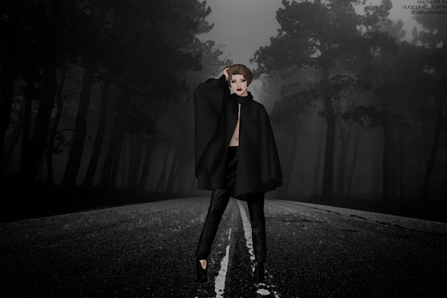
Roxanne: I really like this! I find the outfit to be a stunning addition. A very wise choice! I know you expressed your disliking of the task, as you were confused as to what you needed to do! I take full responsibility in that as I feel I was to vague in my task briefing. But, since you got a demon I feel the model should have a darker presence than just a simple make up pallet that you gave. the pants are just amazing! It looks like leather! You made it very smooth and very realistic and I am loving it! The cape is my favorite piece in this photo. Perfectly shaded and perfectly high lighted! I do like the creepy forest road. Its vast and empty and gives me a sort of eerie feeling like I wanted! Overall you did very well!
Maria: I'm not a fan of the fact you mixed the clothes together. I mean the pants aren't the best pick for this cape . Also your theme was to pick a vampy model, which is not the case here. I would love to see a messy hair instead of this one . Talking about the technique , it's really nice.
Gabrielle
Roxanne: So, At first glance I like it a lot. After looking at it I feel it is weaker than your first task. I don't see crossroads demon. I see a hot woman walking around in the mist in central park. I do like whats going on with the hands though. Very mystical. The detail on the clothes is superb! Graphically this task is good! Overall its average. The hair is a little messy. The skin is good, you shaded very well, and realistically! I just don't have the feeling of like eeriness, or darkness in here. So that is what is pulling you down.
Maria: That's the best entry for this task. Like really, you followed the theme and everything is amazing, i love the shading on the skin and the clothes, i love how the model is running, i also love how the hair is messy . The make up is great as well . WOW
Nora
Roxanne: This task is the strongest out of this group! The leather boots, the feathery dress, the hair, the setting. Its all very creepy, and yet very high fashion! The way you shade is very different from others! The background is spooky which i like! The one thing I must say is I am not a fan of the way you shaded and highlighted the hair. It looks like a mop, but i mean there is only one layer it looks like, so the detail doesn't stand out. Overall, it looks really good! Keep it up Nora!
Maria: I love how you tried to play with the shadows especially on the face. The hair looks good. The fur is making it more winter-ish which is a good thing. You really nailed it with those boots. i would prefer to see smokey eyeshadow though but all in all , it's a great entry. Well done !
The Cult
Mealanie
Roxanne: Overall, I think the idea you went for is super cool, and very ingenious, but again, the quality of this is very poor. You need to be a lot more neat. Everything is super sharp, and messy. I know you can do better, I really think you can, but you just are not showing it.
Maria: wow , the face is really scary and that's what we're really searching for. I know that the mirror is hiding the dress so i can't really judge the details of the dress, you could do the model naked though (the reflected one). The arm is weird . It seems really big compared to the body and fingers . But still, i like the scene here.
Beth
Roxanne: Beth, you definitely impressed. I feel you were one of the designers who really understood the task. All the demonic signs show and make a story of a ritual that had taken place. You were the only one who used the background as part of the scene, as interacting with it i mean. This is just so amazing! I find no flaws for me to critique. The model was a great choice. Very vampy! I AM LOVING the make-up, it is so awesome! You definitely blew me away!
Maria: that's actually a nice entry, I would prefer if you used the side face. It's not that hard to make since it's not a modeling contest. The shading on the coat is fabulous. I would change the lip color tho to something darker.
The Evil Queen
Skouri
Roxanne: Skouri, What a huge step up from Task 1! I feel this is the strongest one. She looks really like laid back, but like what are you going to do? The leather and the crown is the stand out. I really love this! The back of the model, is bumpy, which kind of looks gross. So you should be aware of the smooth lines and selections. The face is amazing! Perfectly shaded! You have proven to be a force to watch out for! The background is very spooky. I like the treasure chest. IT makes a story, like she is guarding her precious treasure. Overall fantastic step up from you!
Maria: That's a good graphic. What i like is that you used a side face which is the trend actually, i also liked the headpiece, it's making the graphic more tragic. I would love to see a dark makeup instead . And if you got rid of the golden details it would be better.
Amina
Roxanne: I really like this! I love how you made it the like evil queen, holding a poison apple. It really is amusing! The graphic itself is amazing! The Dress is just fantastic. The depth you made is realistic, and the leather sleeves are just beyond impressive. I really think you chose a good model, she looked very evil, and mean. The red lip is just killer! Overall it is superb! Well done!
Maria: thats a good one also i love the dramatic scene right here, love the crown. Not a big fan of the transparent part , but still it's a nice dress. The makeup is great and love how you're holding an apple. Great entry.
Unfortunately Bianca was unable to send in her marks, so elimination will be hard.
ELIMINATION
So many great entries. Only one impressed enough to earn best photo! That designer is...
SKOURI!
Nice job! You had the most positively stable judging. So that's why you won this week!
Coming in a super close second. (I actually felt bad that they didn't win).
Beth!
3. Nora
4. Kirsten
5. Amina
Bottom 2
Gabrielle, and Maelanie
Gabrielle, I know you are shocked that you are in the bottom, but only because of the really opposite marks. I liked it, but felt you the one who least fit the theme. But Maria felt it was the one who fit the most. Even though it was a good graphic, you had the most risky marks. Your task 1 was AMAZING, and graphically this one was too, but it just wasn't the strongest OVERALL.
Maelanie, Your here again, because you didn't really improve from task 1. You may have been one of the ones who really followed the task, and we made it clear you did, but I fear you wont make it farther than you are right now...
Unfortunately, Maelanie you are eliminated this week. Be happy because you impressed us this week, impressed me last week, but you just are the weakest graphically here. I am sorry. Good luck in the future.
Dani was also eliminated, she had to drop out as life got super busy. Good luck in the future!
TASK 3
America's Next Top Model
So, Before we get into the task, I held a little raffle to see which 6 models would be chosen. Lets take a look. these are RANDOMLY selected.
1. Lil_Rocker_grl (my sister wanted to enter her doll :P)
2. FunOpler
3. Mitkatsi
4. Fashion.By
5. Kadet12
6. Janettelow
Congratulations guys!
Now, This task as you saw, has to do with my FAVORITE show on earth. AMERICA'S NEXT TOP MODEL. I will be assigning you a model, and a link that has a certain cycles portfolio. Make sure to recreate the photo exactly as it is. This will help you practice with details. Onto the ASSIGNMENTS
Our task winner...
Skouri - Kadet12 CYCLE 18 https://www.yahoo.com/tv/ss/-america-s-next-top-model-cycle-18-slideshow/photo-ashley-3-28-12-photo-1332976210.html?nf=1
Beth - Fashion.By Cycle 13 http://antmphotoshoots.tumblr.com/tagged/cycle_13
Nora - FunOpler Cycle 7 http://antmphotoshoots.tumblr.com/tagged/cycle_7
Kirsten - LilRockerGrl Cycle 12 http://antmphotoshoots.tumblr.com/tagged/cycle_12
Amina - Mitkatsi Cycle 9 http://antmphotoshoots.tumblr.com/tagged/cycle_9
Gabrielle - Janettelow Cycle 15 http://antmphotoshoots.tumblr.com/tagged/cycle_15
There you go! Congrats to the top 6! You need to work extra hard, and I think this is a very strong group!
Task 2 is due: Wednesday September 16
Good luck Girlies
XoXo Roxy


